
Table of Contents
Website navigation is the system that helps visitors move between pages, understand where they are, discover related information, and reach important actions such as contacting a business, requesting a quote, booking a service, or purchasing a product.
Good navigation is not simply a row of links in a header.
It connects information architecture, user experience, accessibility, internal linking, search-engine discovery, and conversion paths.
A visually impressive website can still perform poorly when visitors cannot quickly determine where to go next. At the same time, a navigation system designed only around keywords can become cluttered and frustrating.
The strongest approach is to build navigation around user needs first while ensuring that important pages remain logically organized and technically discoverable.
This guide explains 17 website navigation best practices and provides a practical framework for auditing an existing navigation system.
Quick Answer: What Makes Good Website Navigation?
Good website navigation is clear, predictable, consistent, accessible, and aligned with the website’s most important user journeys.
A strong navigation system normally uses descriptive labels, a logical page hierarchy, crawlable HTML links, a focused primary menu, mobile-friendly controls, breadcrumbs where useful, contextual internal links, and alternative discovery methods such as site search on larger websites.
The objective is not to place every page in the menu.
The objective is to help people reach the right page with the least unnecessary friction.
What Is Website Navigation?
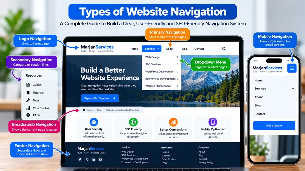
Website navigation refers to the links and interface elements that allow visitors to move through a website.
Navigation can include:
- Primary navigation.
- Secondary navigation.
- Dropdown menus.
- Mega menus.
- Mobile menus.
- Breadcrumbs.
- Footer navigation.
- Sidebar navigation.
- Contextual internal links.
- On-site search.
These systems perform different jobs.
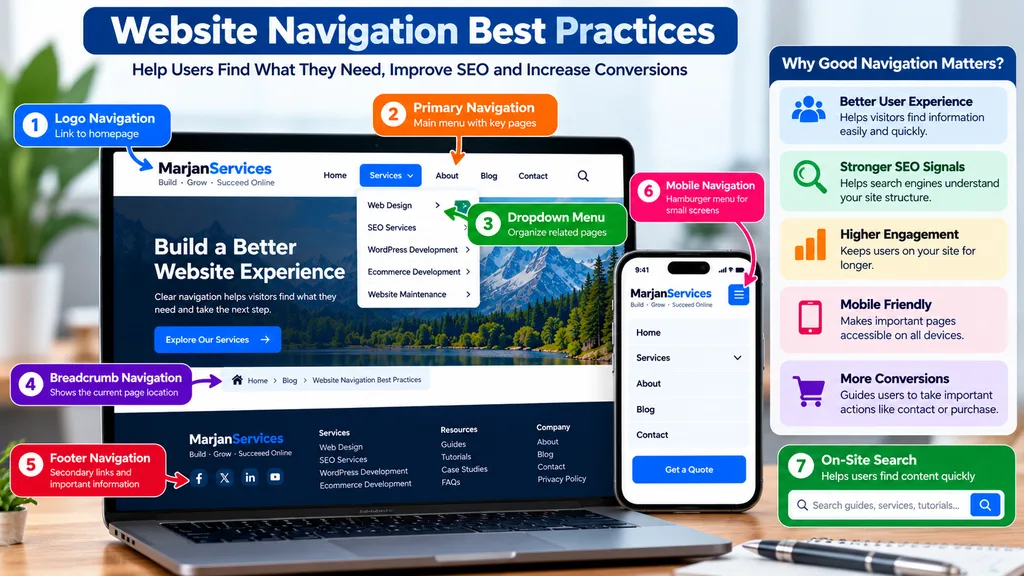
The primary menu communicates the major sections of the website. Breadcrumbs provide orientation within a hierarchy. Contextual links help users discover closely related information. Search provides an alternative discovery method when a website contains too much information to expose through menus alone.
Navigation should therefore be treated as an interconnected system rather than a single header component.
Why Website Navigation Best Practices Matter
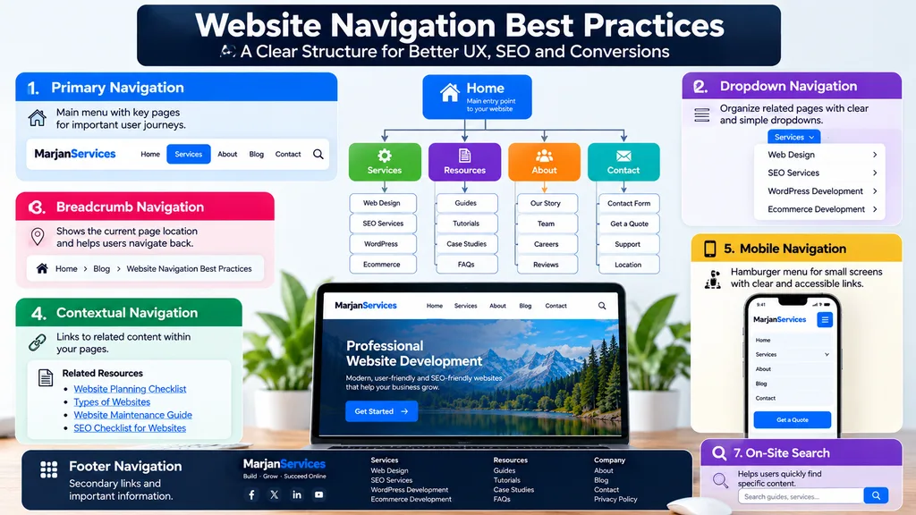
Navigation influences three major areas.
User Experience
Visitors arrive with a goal.
They may want to understand a service, compare prices, read a guide, find a product, contact the company, or solve a problem.
Navigation should shorten the distance between that goal and the appropriate information.
Search Discovery
Search engines use links to discover pages and understand relationships between content.
Important pages that are isolated from the rest of the website can be more difficult to discover and may receive fewer meaningful internal signals.
Navigation and contextual internal linking therefore contribute to a site’s overall information architecture.
Conversions
A visitor cannot convert on an offer they cannot find.
Commercial pages, pricing information, contact options, product categories, booking flows, and other high-value destinations should be accessible through logical customer journeys.
Navigation does not create demand by itself, but poor navigation can interrupt existing demand.
1. Start With User Intent, Not Your Organization Chart
One of the most common navigation mistakes is structuring a website around the internal organization of the company.
Visitors usually do not know or care which department owns a service.
They think in terms of problems, products, services, tasks, and outcomes.
Instead of asking:
“How is our company organized?”
Ask:
“What are visitors trying to accomplish?”
A service business might identify journeys such as:
Research a problem.
Understand available services.
Compare options.
Review evidence.
Check pricing.
Request a quotation.
A store may instead prioritize:
Browse categories.
Search products.
Filter choices.
Review product information.
Check delivery details.
Complete a purchase.
Navigation should reflect these real journeys.
2. Create a Logical Website Hierarchy
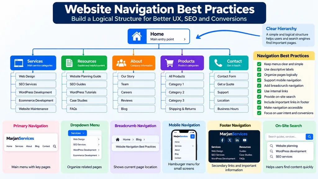
Navigation becomes easier when the underlying website architecture is clear.
A simple service website might use a hierarchy such as:
Home.
Services.
Individual service pages.
Resources.
Individual guides.
About.
Contact.
A larger ecommerce website may require categories, subcategories, product pages, support information, account functions, and search.
Avoid creating unnecessary layers.
If an important page is buried beneath several confusing categories, both users and crawlers may have difficulty reaching it efficiently.
The hierarchy should also establish topical relationships.
For example, a broad website development page may link to specific WordPress, ecommerce, maintenance, or optimization services, while educational guides support those commercial pages through contextual internal links.
3. Keep the Primary Menu Focused
The primary navigation is not a sitemap.
Trying to place every useful URL in the header creates clutter and weakens prioritization.
Current industry guidance commonly recommends keeping primary navigation relatively focused, often around five to seven major choices for ordinary business websites. That number is not a universal SEO rule. Complex websites may legitimately require a different structure.
The more important principle is prioritization.
Ask whether each top-level menu item deserves sitewide visibility.
A secondary legal page, minor blog category, or rarely used resource may belong in the footer or contextual navigation rather than the primary menu.
4. Use Descriptive Navigation Labels
A navigation label should help a visitor predict the destination before clicking.
Clear labels usually outperform clever but ambiguous terminology.
For example:
“Website Development” is more informative than “Solutions” when the destination specifically covers website development.
“Pricing” is clearer than “Investment” if the page contains prices.
“Contact” is immediately recognizable.
Labels should remain concise, but clarity is more important than making them artificially short.
The same principle supports search understanding because descriptive anchor text provides context about the destination page.
Do not stuff keywords into navigation labels.
A menu should remain readable to humans.
5. Make Important Navigation Links Crawlable
A menu can work visually while still being poorly implemented for search crawlers.
Do not depend on unconventional JavaScript interactions when a normal link can perform the job.
This is particularly important for menus generated by custom themes, JavaScript frameworks, filtering systems, or interactive components.
After implementing navigation, inspect the rendered page and verify that important destinations are represented by genuine crawlable links.
6. Keep Navigation Consistent Across Pages
Visitors build a mental model of a website as they use it.
If the main navigation changes unexpectedly between pages, they have to relearn the interface.
Keep repeated navigation components consistent in their relative order, terminology, and behavior unless there is a legitimate reason to change them.
Consistency is also an accessibility consideration.
Users with cognitive disabilities, low vision, or assistive technologies can benefit from predictable navigation patterns.
The blog should not feel like a separate website unless it genuinely is one.
Likewise, service pages should not unexpectedly remove the navigation available elsewhere merely to trap visitors inside a conversion page.
7. Design Mobile Navigation as a Primary Experience
Mobile navigation should not be treated as the desktop menu squeezed onto a smaller screen.
Review:
Tap targets.
Menu opening and closing behavior.
Dropdown operation.
Focus behavior.
Label readability.
Scrolling.
Orientation changes.
CTA visibility.
Nested menus.
Search.
Account and cart controls where applicable.
A hamburger or drawer menu may be appropriate when space is limited, but users should still be able to identify how to open it and understand the available destinations.
Test navigation on actual devices rather than relying entirely on a desktop browser’s responsive preview.
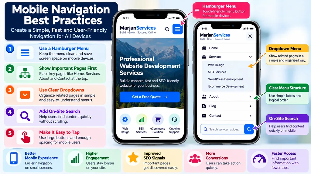
Mobile website navigation best practices use clear menus, touch-friendly controls, organized dropdowns, and on-site search to improve usability, SEO, engagement, and conversions.
8. Use Dropdown Menus Carefully
Dropdowns can organize related pages without overcrowding the primary menu.
They become harmful when they create deep chains of nested choices.
A visitor should not have to navigate through multiple fragile hover states simply to reach a service page.
Group pages according to meaningful categories.
If the website contains many related destinations, consider whether a well-organized mega menu, category page, or secondary navigation system would be easier to use than several levels of dropdowns.
Dropdowns must also work with keyboards and touch interfaces.
9. Use Mega Menus Only When Complexity Justifies Them
Mega menus can work well for large ecommerce websites, universities, marketplaces, publications, and businesses with extensive product or service catalogs.
They are unnecessary for many small websites.
A mega menu containing 40 links does not automatically improve navigation merely because all pages become visible.
Group items clearly.
Use understandable headings.
Prioritize important destinations.
Avoid decorative complexity.
Test the menu on mobile and with keyboard navigation.
For a small service website with six major destinations, a simple menu is normally easier to understand.
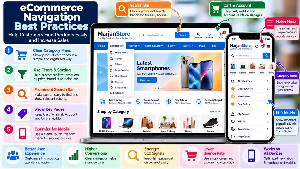
Ecommerce navigation best practices use clear product categories, filters, search, mobile-friendly menus, and visible account and cart links to improve UX, SEO, and conversions.10. Add Breadcrumb Navigation Where It Helps Orientation
Breadcrumbs show users where the current page sits within a hierarchy.
A typical trail may look like:
Home > Services > Website Development > Ecommerce Development
Breadcrumbs are especially useful for websites with deeper structures, such as ecommerce stores, documentation websites, educational platforms, and large content libraries.
They provide an additional way to move upward through the hierarchy without repeatedly using the browser’s back button.
Google also supports BreadcrumbList structured data for eligible breadcrumb implementations.
The visible breadcrumb should represent a useful user path rather than existing solely as structured data.
11. Use Contextual Internal Links Beyond the Menu
Not every useful page belongs in sitewide navigation.
Contextual internal links allow pages to connect according to meaning.
For example, an article about planning a business website can naturally link to a website development service when the reader reaches the implementation stage.
A guide about website security can link to SSL, backups, malware prevention, or maintenance resources where those topics genuinely help.
This creates a stronger topical architecture than trying to put every article into the header.
Think of navigation as several layers:
Primary navigation establishes major destinations.
Breadcrumbs establish hierarchy.
Contextual links establish semantic relationships.
Related-content modules support discovery.
Footer navigation provides secondary routes.
Together, these layers create a more useful system.
12. Connect Informational Content With Commercial Pages
A common architecture problem occurs when a blog becomes isolated from the business side of the website.
Hundreds of informational articles may receive internal links from other articles but provide no natural path toward the relevant service or product.
Avoid forcing sales links into every paragraph.
Instead, identify the legitimate relationship between information and commercial intent.
For example:
A website planning guide can lead to professional website development.
A website maintenance guide can lead to maintenance services.
An ecommerce guide can lead to ecommerce development.
A technical SEO guide can lead to relevant optimization services.
This helps visitors progress naturally from education to evaluation when they are ready.
13. Use Footer Navigation Strategically
The footer is not a storage area for every URL that did not fit elsewhere.
Use it to provide useful secondary access.
Depending on the website, appropriate footer links may include:
Major services.
Important resources.
Contact information.
About information.
Privacy policy.
Terms.
Accessibility information.
Support.
Important location information.
Social profiles where appropriate.
The footer should remain organized and usable on mobile.
If it contains dozens of unrelated links without hierarchy, it becomes another navigation problem.
14. Provide More Than One Way to Find Important Content
Different users navigate differently.
Some prefer menus.
Others use search.
Some follow contextual links.
Others use breadcrumbs or category pages.
WCAG guidance recognizes the value of providing multiple ways to locate pages within a set of pages, subject to appropriate exceptions.
For a larger content website, useful discovery methods may include:
Primary navigation.
Site search.
Category pages.
Breadcrumbs.
Contextual links.
HTML sitemap where appropriate.
Filters.
Related content.
Do not add every mechanism indiscriminately.
Choose the methods appropriate to the size and complexity of the website.
15. Make Navigation Accessible by Keyboard
Navigation must work for people who do not use a mouse.
Test the website using the keyboard.
Users should be able to reach interactive navigation elements, understand where focus currently sits, operate menus, and move through controls in a logical order.
Do not remove visible focus indicators without providing an effective alternative.
Custom menus, modal navigation, mega menus, and interactive dropdowns deserve particular attention because poorly implemented custom components frequently create accessibility barriers.
Use semantic HTML wherever practical.
ARIA can add useful accessibility information when necessary, but it should not be used to repair avoidable problems created by incorrect native markup.
16. Treat Site Search as Navigation
Large websites often need search because no menu can expose every useful page.
Site search is particularly useful for:
Large ecommerce catalogs.
Documentation.
Knowledge bases.
Publications.
Universities.
Marketplaces.
Large service libraries.
Search should return relevant results, tolerate reasonable variations where possible, and help users recover when no exact match exists.
Analyze internal search queries when reliable data is available.
They can reveal products, services, terminology, or information that users expect but cannot easily locate through existing navigation.
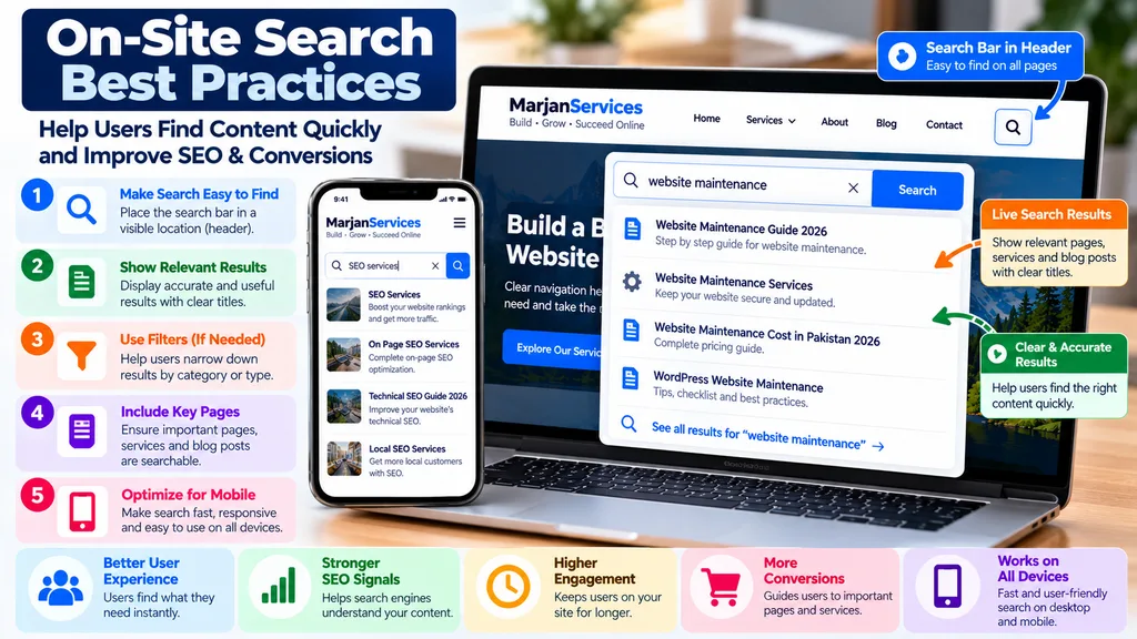
17. Measure and Improve Navigation With Evidence
Navigation should not be considered permanently finished after launch.
Measure how people use it.
Useful evidence may include:
Navigation click data.
Internal search queries.
Landing-page journeys.
Form and purchase funnels.
Pages with unusually high exits.
User testing.
Customer questions.
Support requests.
Search Console queries.
Heatmaps or session recordings where they are collected responsibly and interpreted carefully.
Do not redesign navigation merely because a design trend changes.
Change it when evidence indicates that users cannot find important information or when the website’s structure has materially evolved.
Website Navigation Best Practices for SEO
Website navigation can support SEO, but navigation should not be manipulated as a keyword-placement system.
Google uses links to discover pages and understand relevance.
That means important pages should have crawlable internal paths.
Descriptive anchor text can provide useful context.
A logical architecture can also make relationships between broad and specific topics clearer.
However, adding dozens of keyword-rich menu links does not automatically create stronger SEO.
It can make the interface worse.
The correct objective is to make important pages discoverable while maintaining clear information architecture.
Website Navigation and AEO
Answer Engine Optimization benefits from clear information organization.
A navigation system itself will not guarantee inclusion in an AI-generated answer.
However, coherent site architecture can support a broader content system in which entities, services, guides, and related topics are easier to understand.
For AEO-oriented content architecture:
Give each major search intent a clear primary URL.
Avoid publishing several pages that answer the same question with slightly different wording.
Use descriptive page titles and headings.
Connect related resources contextually.
Keep important factual information accessible in normal page content.
Use structured data only when it accurately describes visible content, and the page meets applicable requirements.
Website Navigation and GEO
Generative Engine Optimization should not be treated as a separate collection of tricks.
Clear information architecture, factual content, source transparency, meaningful entity relationships, crawlable pages, and well-structured answers are useful foundations for both traditional search and generative search experiences.
Navigation contributes by making relationships between pages explicit.
For example:
Website Development can function as a broad commercial entity.
Website Planning can support pre-development decisions.
Website Navigation can address information architecture and movement.
Website Maintenance can address post-launch operations.
Technical SEO can address crawling, indexing, performance, and related technical issues.
Connecting these pages coherently creates a stronger topical system than publishing isolated articles.
Common Website Navigation Mistakes
Avoid these recurring problems:
Too many top-level menu items.
Vague labels.
Deep nested dropdowns.
Different navigation on similar pages.
Important pages with no internal links.
Blog content isolated from commercial pages.
Tiny mobile tap targets.
Menus that depend entirely on hover behavior.
Broken keyboard interaction.
Missing focus visibility.
JavaScript-only links that are difficult to crawl.
Huge mega menus with no hierarchy.
Placing every minor page in the header.
Using keyword stuffing in menu labels.
Ignoring internal search data.
Treating the footer as a link dump.
Changing navigation without measuring the impact.
Website Navigation Audit Checklist
Use this short audit on an existing website.
First, identify the website’s most important user tasks.
Then check whether those destinations are easy to find from relevant entry pages.
Review whether primary menu labels clearly describe their destinations.
Check whether the hierarchy reflects customer needs rather than internal departments.
Test every major menu on desktop and mobile.
Use the keyboard to test navigation and focus behavior.
Confirm that important links use crawlable HTML anchors.
Review dropdown depth.
Check breadcrumb implementation on deeper pages.
Review footer organization.
Find important pages that have weak internal-link support.
Check whether blog content connects naturally to related commercial pages.
Review whether important content has more than one practical discovery route when appropriate.
Test site search if the website provides it.
Review navigation analytics and customer behavior where reliable data exists.
Finally, remove links or complexity that do not help users reach meaningful destinations.
How Many Items Should a Website Navigation Menu Have?
There is no universal number that applies to every website.
For many small and medium business websites, approximately five to seven top-level choices can provide a useful starting point because it encourages prioritization and keeps the header manageable.
A large ecommerce store, university, marketplace, or documentation website may require a more sophisticated architecture.
Do not optimize for an arbitrary number.
Optimize for clarity.
Are Hamburger Menus Bad for SEO?
A hamburger menu is not inherently bad for SEO.
The important questions are whether the links are crawlable, whether important pages remain discoverable, and whether the interaction works reliably for users.
Hamburger menus are common on mobile because screen space is limited.
On desktop, hiding a small number of important destinations behind an unnecessary interaction may reduce discoverability for users.
Choose the pattern based on usability rather than fashion.
Do Breadcrumbs Help SEO?
Breadcrumbs can help users understand a page’s position in the website hierarchy and move to broader sections.
Google supports BreadcrumbList structured data and may use breadcrumb information in desktop search-result presentation.
Breadcrumbs should therefore be implemented because they accurately represent useful hierarchy, not because they are expected to create a ranking shortcut.
Should Every Page Be in the Main Menu?
No.
The primary menu should prioritize major destinations.
Supporting articles and narrower pages can be reached through category pages, contextual internal links, breadcrumbs, related-content modules, search, and other appropriate discovery paths.
Putting every page in the header destroys prioritization.
What Is the Best Navigation Structure for a Small Business Website?
A simple service business might use:
Home.
Services.
Portfolio or Work.
About.
Resources.
Contact.
The exact structure should reflect the business.
A company with several important service categories may expose those categories directly or place them beneath Services.
A business that depends heavily on consultations may highlight a Request a Quote or Book a Consultation action.
Do not copy another company’s navigation without considering your own customers.
Final Thoughts
Website navigation works best when it is treated as information architecture rather than decoration.
Start with what visitors need to accomplish.
Create a logical hierarchy.
Prioritize the most important destinations.
Use clear labels and crawlable links.
Keep navigation predictable across pages.
Design deliberately for mobile.
Support deeper journeys with breadcrumbs and contextual internal links.
Make navigation usable with a keyboard.
Use search when the website’s scale justifies it.
Finally, measure how real visitors use the system and improve it based on evidence.
The best website navigation is not the menu with the most links or the most creative design.
It is the navigation system that helps people understand where they are, find what they need, and move confidently toward their next useful action.