Table of Contents
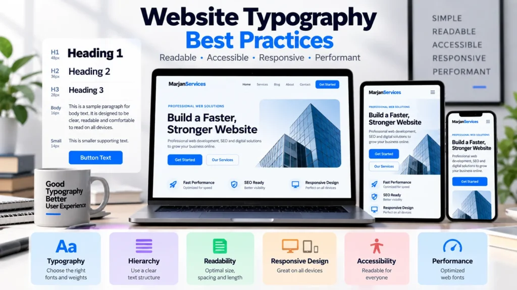
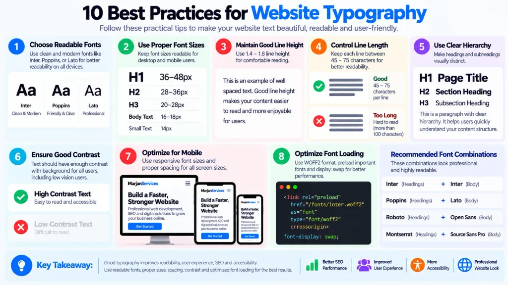
Website typography best practices are not simply rules for choosing attractive fonts. Effective web typography is a complete system for making text readable, scannable, accessible, responsive, visually consistent, and efficient to load across different devices and screen sizes.
A beautiful typeface cannot compensate for cramped paragraphs, weak hierarchy, poor contrast, broken text resizing, or several unnecessary font files slowing down the page.
The strongest typography systems balance four priorities at the same time: readability, visual hierarchy, accessibility, and performance.
This guide explains ten practical rules for building that system and, more importantly, how to test whether each typography decision actually works.
Typography decisions should ideally be documented during the website planning process, alongside layout, content, accessibility, performance, and responsive-design requirements.
Quick Answer: What Are the Most Important Website Typography Best Practices?
Good website typography uses readable typefaces, a consistent hierarchy, comfortable text sizing, appropriate line height and line length, restrained font variation, responsive scaling, sufficient contrast, accessible resizing, efficient font delivery, and consistent testing across real content and devices.
There is no universal font size, line height, font pairing, or type scale that is perfect for every website. Treat common values as starting points, then test the actual typeface, language, audience, device, and content.
Why Website Typography Best Practices Matter
Typography controls almost every text-based interaction on a website.
Visitors read navigation labels, headings, paragraphs, buttons, product information, form labels, error messages, pricing, FAQs, and calls to action. If those elements are difficult to read or visually inconsistent, the problem affects more than appearance.
Typography influences how quickly users understand hierarchy, whether long-form content feels comfortable, whether a mobile layout remains usable, whether text can be enlarged without breaking the interface, and whether web fonts create unnecessary rendering delays or layout shifts.
Typography also intersects with accessibility requirements. WCAG 2.2 requires normal text to meet a minimum contrast ratio of 4.5:1 in applicable circumstances and requires text to remain usable when resized to 200 percent. WCAG also requires content not to lose information or functionality when users override certain text-spacing properties.
Typography is therefore a design system, accessibility concern, and front-end engineering decision at the same time.
1. Choose Fonts for the Job, Not for the Preview
A font library preview usually shows a typeface under ideal conditions. Your actual website will use it in paragraphs, menus, buttons, forms, prices, headings, and mobile interfaces.
Start by defining what each typeface needs to do.
A body typeface must remain comfortable through paragraphs and smaller interface text. A heading typeface can carry more visual personality because users encounter it in shorter bursts.
Judge candidate fonts using real website content rather than isolated specimen text.
Test common letter combinations, numbers, punctuation, prices, uppercase labels, and the languages your website actually serves.
A global website also needs to consider character coverage. A font that looks excellent in English may not contain the glyphs required for Urdu, Hindi, Arabic-derived scripts, Devanagari, or another language your audience uses. When the primary font lacks those characters, browsers may substitute another typeface and create an inconsistent visual system.
How to Test
Create one sample page containing a long paragraph, H1, H2, button, form field, navigation label, number, currency amount, and any required non-English script.
If the font only looks good in the hero heading but becomes uncomfortable elsewhere, it is not a suitable primary website typeface.
2. Use Fewer Typefaces and Fewer Unnecessary Weights
More fonts do not automatically create stronger design.
For many business websites, one versatile font family is enough. Two complementary families can work well when a clear distinction between headings and body content strengthens the brand.
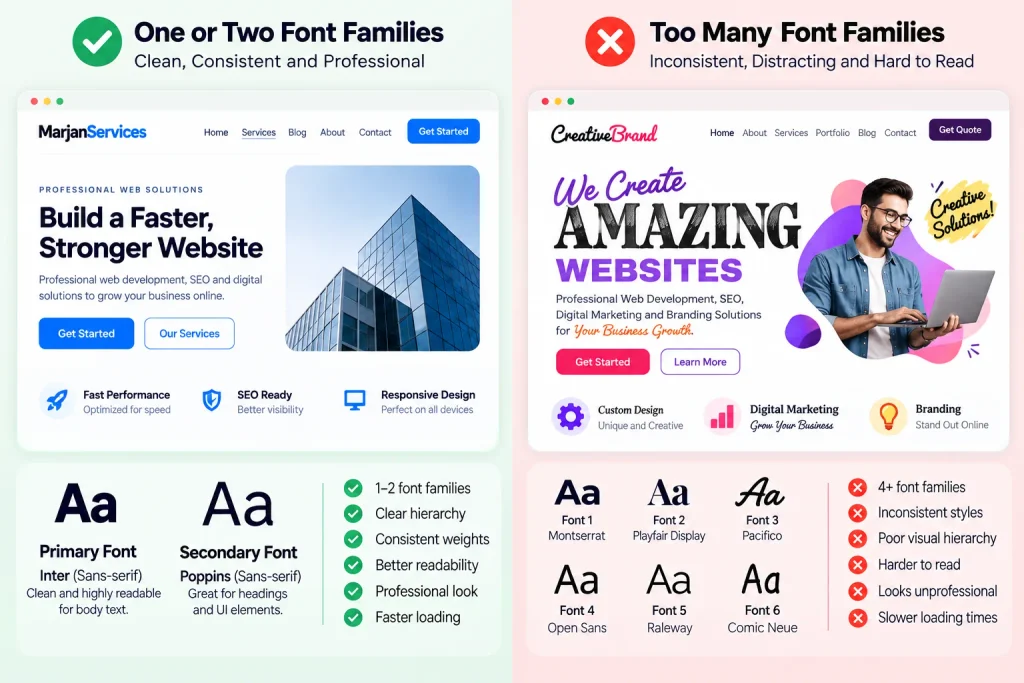
A third or fourth family should require a real purpose.
The same restraint should apply to font weights.
Loading regular, medium, semibold, bold, and several italic variants when the interface actually uses only regular and bold creates unnecessary design complexity and may increase font-delivery cost.
The practical question is not:
“How many fonts are allowed?”
It is:
“Does every additional font file solve a real communication problem?”
Better Decision Rule
Start with one family.
Add a second only if it creates useful hierarchy or brand distinction that cannot be achieved through size, weight, spacing, or color.
Then load only the weights and styles the live interface actually uses.
This is particularly important for web fonts because font delivery affects rendering performance. web.dev notes that delayed font loading can affect text rendering and, in some situations, LCP, while differences between fallback and final fonts can contribute to CLS.
3. Build a Typography Hierarchy Instead of Picking Random Sizes
A strong typography system tells readers what matters before they read every word.
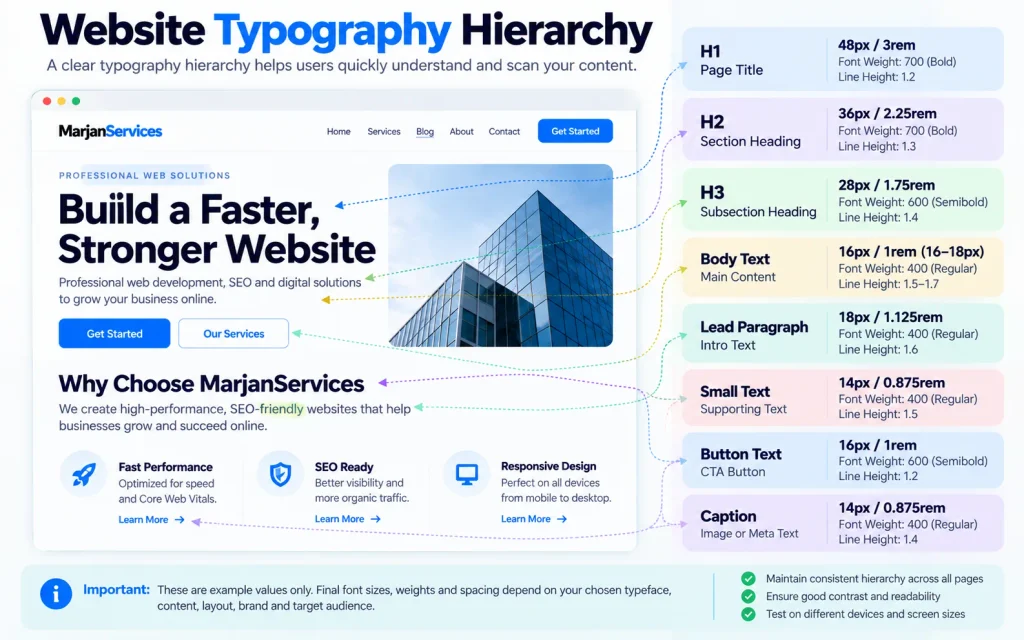
The H1 should look like the primary page title. H2 headings should clearly divide major sections. H3 headings should feel subordinate to H2s. Body text, captions, labels, and metadata should each have recognizable roles.
Do not rely on font size alone.
Hierarchy can also use weight, spacing, contrast, typeface, and placement.
The important principle is consistency.
If one H2 is 32 pixels on one page and an identical H2 role becomes 24 pixels elsewhere without a reason, the system becomes harder to scan and maintain.
Create Roles First
Define roles such as:
Display heading.
Page title.
Section heading.
Subheading.
Body text.
Lead paragraph.
Button or label.
Caption.
Supporting text.
Then assign styles to those roles.
A reusable system scales better than manually styling each block of text.
Type Scale
A modular scale can provide a useful starting framework, but mathematical ratios are not mandatory.
Choose a scale that works with your content.
A marketing homepage may use a large display range. A documentation interface may need a tighter scale because more information appears simultaneously.
The correct scale is the one that creates obvious hierarchy without causing awkward wrapping or excessive vertical space.
4. Treat Body Font Size as a Starting Point, Not a Magic Number
Many typography guides state that website body text must be at least 16 pixels.
That is a useful practical starting point for many designs, but it should not be misrepresented as a universal WCAG minimum.
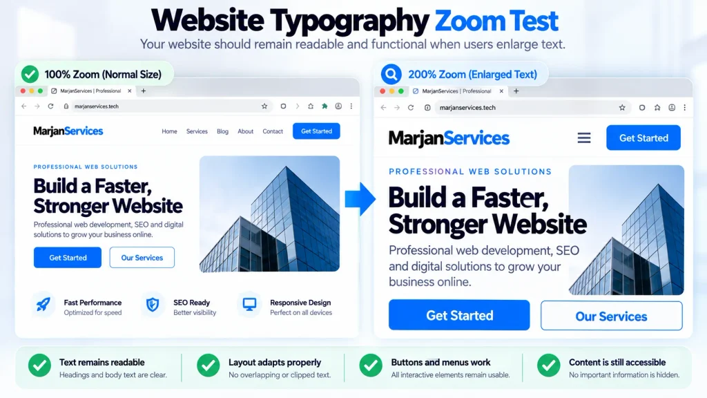
WCAG does not prescribe a universal 16px minimum for body text. Instead, the WCAG Resize Text requirement focuses on allowing text to be enlarged up to 200% without loss of content or functionality.
WCAG 2.2 does not simply say that every paragraph must use 16px text. Its Level AA Resize Text requirement instead requires text, with specified exceptions, to remain usable when enlarged up to 200 percent without loss of content or functionality.
A 16px value also looks different across typefaces because x-height, character width, and weight vary.
Therefore, evaluate body size using the actual font.
For general business and editorial websites, around 1rem is often a sensible starting point because browsers commonly map that to the user’s default text size. But the final decision should account for the font, device, content density, and audience.
How to Test
Read three or four full paragraphs at normal laptop distance.
Test the same page on a real phone.
Then zoom to 200 percent.
Check whether text remains readable and whether buttons, cards, menus, and forms still work.
If larger text causes clipping, overlap, or hidden controls, the problem is not solved merely because the original font size looked comfortable.
5. Balance Line Height, Line Length and Paragraph Spacing
Readable typography is created by relationships, not isolated numbers.
Font size, line height and line length affect each other.
A paragraph with comfortable font size can still feel exhausting when the lines stretch across an entire desktop monitor.
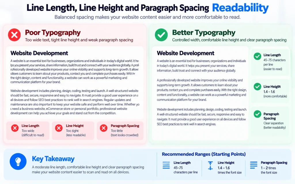
Similarly, extremely tight line spacing can make it difficult for the eye to find the next line.
A line height around 1.4 to 1.6 is often a useful starting range for ordinary body copy, but it should not be treated as a universal requirement. Fonts with larger x-heights or longer line lengths may need more space.
WCAG’s Text Spacing criterion is frequently misunderstood here. It does not state that every website must set its normal line height at exactly 1.5. Instead, applicable content must remain functional when a user overrides line height, paragraph spacing, letter spacing, and word spacing to specified values.
Line length should also be controlled.
For sustained reading, a moderate text column is generally easier to follow than paragraphs spanning the full viewport. Current web-typography guidance commonly uses roughly 45 to 75 characters per line as a practical starting range, while the exact value should still be tested with the actual font and content.
Practical Test
Create the same paragraph at three container widths.
Read each naturally rather than counting seconds.
The correct width should let your eye move comfortably from the end of one line to the beginning of the next without making the text column feel artificially narrow.
6. Make Responsive Typography Truly Responsive
Responsive typography does not mean shrinking desktop text until it fits a phone.
Different screen sizes change line length, wrapping, available space, and reading distance.
Body text may require relatively little variation, while large display headings often need stronger responsive scaling.
CSS clamp() provides a useful modern approach because it can define minimum, preferred, and maximum values in one declaration.
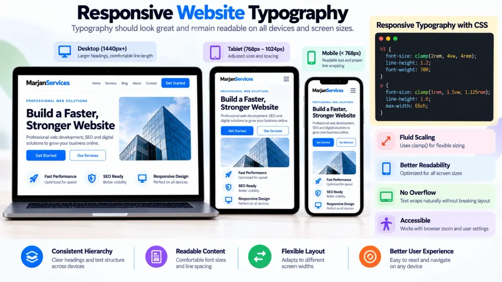
For example:
font-size: clamp(2rem, 4vw, 4rem);
However, accessibility still matters.
MDN specifically cautions that when clamp() controls text size, the maximum should allow sufficient scaling rather than creating a hard ceiling that prevents enlargement. It recommends relative units and enough range to permit text to scale substantially.
Do not use viewport units alone for essential text.
A value such as font-size: 4vw can become unreasonably small or large depending on screen dimensions.
Responsive Typography Test
Test at narrow phone width.
Test a larger phone.
Test tablet width.
Test laptop width.
Test wide desktop.
Then repeat with browser zoom.
Watch especially for headings that wrap into awkward one-word lines, buttons whose labels no longer fit, cards whose fixed heights clip text, and navigation components that collapse when users enlarge type.
7. Design Typography for Accessibility, Not Just Aesthetics
Accessible typography begins with readable text, but it extends beyond typeface choice.
Contrast matters.
WCAG 2.2 Level AA requires a contrast ratio of at least 4.5:1 for ordinary text, with a 3:1 threshold for qualifying large-scale text.
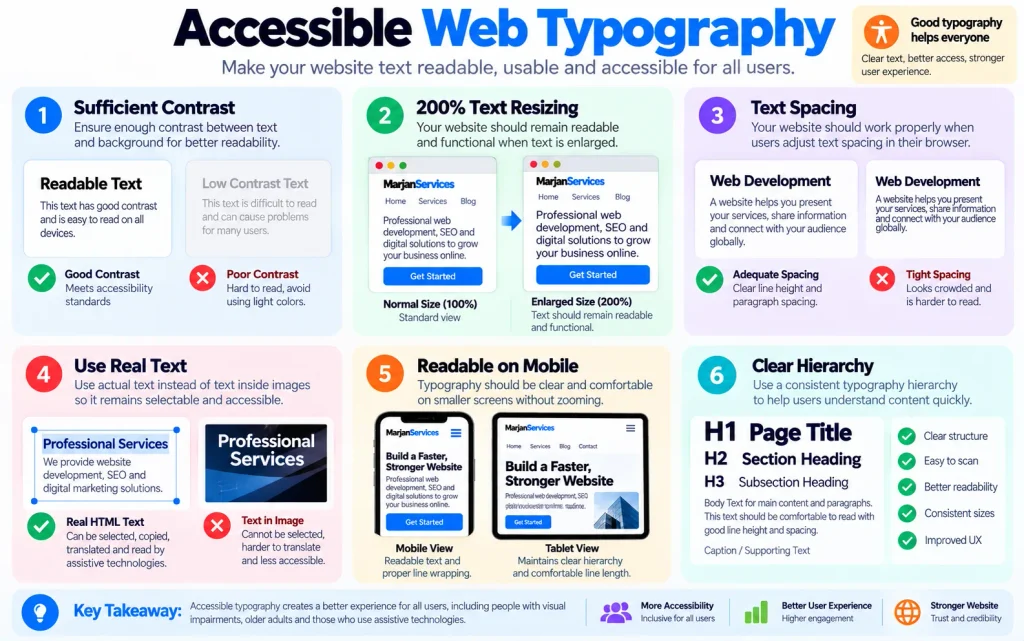
Do not use pale gray body copy simply because it looks elegant in a design mockup.
Text resizing matters.
Users must be able to enlarge text without losing content or functionality.
Spacing adaptability matters.
The interface should survive user-defined changes to line, paragraph, letter, and word spacing.
Text should also remain real text wherever possible rather than being embedded inside images. WCAG explicitly prefers actual text where the technology can achieve the required presentation, subject to limited exceptions.
Accessibility Test Matrix
| Test | What to Check |
|---|---|
| Contrast | Body text, links, buttons and supporting text remain distinguishable |
| 200% zoom | No important text or controls disappear |
| Text spacing override | Content does not clip or overlap |
| Mobile | Type remains legible without unnecessary zooming |
| High contrast | Important meaning does not depend on subtle color differences |
| Images of text | Essential information remains selectable/readable text where practical |
Accessibility is not achieved by selecting an “accessible font” and ignoring the rest of the interface.
8. Optimize Web Fonts Without Assuming One Hosting Method Is Always Faster
Web font performance is one of the biggest gaps in generic typography articles.
Every web font introduces a delivery decision.
The browser may need to discover the CSS, request font resources, wait for them to arrive, render a fallback font, then replace it with the intended font.
This process can delay text rendering or cause visual movement.
web.dev identifies delayed font rendering and font-swap layout shifts as important font-performance concerns. It also notes an important nuance: self-hosted fonts are not automatically faster in every real deployment. Server performance, CDN configuration, network setup, and third-party delivery all matter.
That means “always self-host” is too simplistic.
Test both options under realistic conditions.
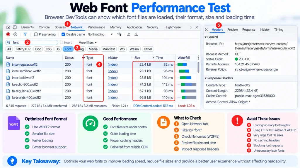
Prefer Efficient Font Formats
WOFF2 is the primary modern web-font format and provides strong compression. web.dev recommends it for contemporary websites.
Subset Carefully
A site that only requires a particular character set may reduce transfer size by loading only necessary glyph ranges, provided the font license permits that modification and the site’s actual language requirements are respected.
Do not subset a global site to Latin characters and then discover that Urdu, Hindi, or another required script is missing.
Be Selective With Preload
Preloading can help when a specific font is definitely required immediately above the fold.
Preloading every weight and style wastes bandwidth.
Choose font-display Deliberately
font-display: swap can display fallback text quickly and later replace it with the web font.
font-display: optional may prioritize performance even more strongly by allowing the browser to keep the fallback when the font does not arrive quickly enough.
Neither choice is automatically correct for every website.
web.dev explicitly recommends selecting the strategy according to whether performance, immediate text display, or eventual web-font rendering is the higher priority.
9. Reduce Font-Related Layout Shift
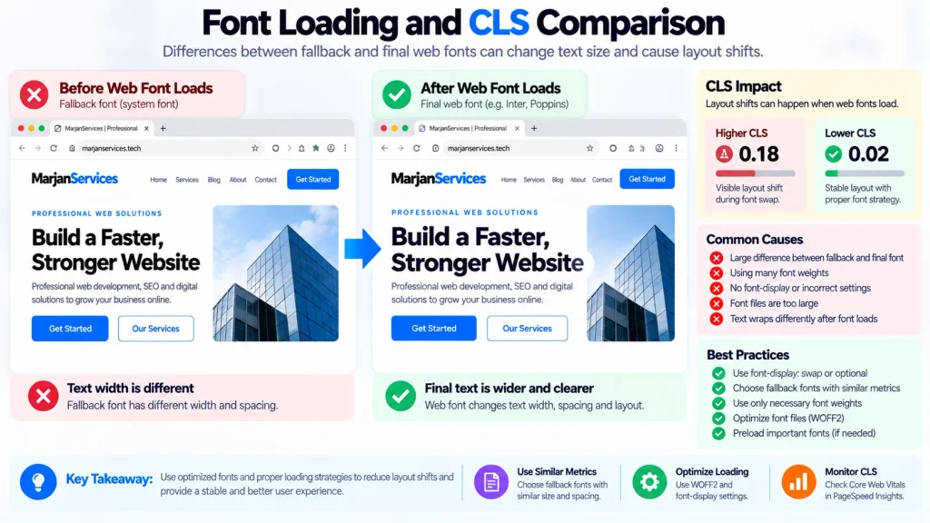
A page can feel unstable when a fallback font renders first, and the final font has different character metrics.
- Text may wrap differently.
- A heading may become taller.
- A button may widen.
- Everything below it may move.
- That contributes to Cumulative Layout Shift.
- Google defines CLS as the Core Web Vitals metric for visual stability and recommends a CLS of 0.1 or less for good user experience. Web fonts are one recognized source of layout shifts.
- The solution is not simply “remove custom fonts.”
- Instead, reduce the difference between fallback and final rendering.
- Choose a fallback with similar proportions.
- Use appropriate font metric overrides such as
size-adjustwhere justified. - Avoid loading unnecessary font files late in the rendering process.
- Measure the actual page with development tools and field data rather than assuming that a visually similar fallback is good enough.
Testing Workflow
First load the page with cache disabled.
Watch the heading and first viewport.
Then inspect layout shifts in browser performance tools.
Compare fallback and final line wrapping.
Finally, confirm field Core Web Vitals after deployment where sufficient real-user data exists.
Typography performance should be measured, not guessed.
10. Build a Typography System That Works Across Languages, Content Types and Teams
A website typography system is successful when it still works six months after launch.
That requires documentation.
Define the approved typefaces, fallback stacks, available weights, heading roles, body styles, line-height rules, maximum reading widths, responsive behavior, text colors and special styles.
Also define multilingual behavior.
English typography is not a universal template for every writing system.
A business targeting Pakistan, India and international audiences may eventually need English, Urdu, Hindi or other regional languages. Font coverage, directionality, script shaping, line height and fallback behavior need to be tested using real translated content.
An English heading that fits neatly on one line may become considerably wider or taller after translation.
Do not solve this by reducing non-English text until it becomes difficult to read.
Design the component to accommodate language variation.
Create Typography Design Tokens
Instead of manually assigning arbitrary values across pages, define reusable roles in your design system or CSS.
For example:
--font-body
--font-heading
--text-body
--text-small
--text-h3
--text-h2
--text-h1
--line-body
--content-measure
The specific names matter less than having one controlled source of truth.
This reduces design drift and makes future accessibility or performance improvements easier to deploy across the entire site.
Website Typography Decision Matrix
| Decision | Useful Starting Point | Test Before Approval |
|---|---|---|
| Typeface | One readable family first | Real paragraphs, UI labels and required languages |
| Number of families | One or two for most ordinary business sites | Does the second family create real value? |
| Body size | Around 1rem is a common starting point | Phone, desktop and 200% zoom |
| Hierarchy | Consistent role-based type scale | Can readers distinguish H1, H2, H3 instantly? |
| Line height | Approximately 1.4–1.6 can be a starting range | Long paragraphs and user spacing overrides |
| Line length | Moderate reading measure | Real long-form content |
| Responsive size | Relative units plus controlled fluid scaling | Mobile, desktop and browser zoom |
| Font files | Only required families, weights and styles | Network panel and transfer size |
| Font format | WOFF2 for modern delivery | Browser support requirements |
font-display | Choose according to rendering priorities | Slow network and layout shift testing |
| Multilingual fonts | Verify actual script coverage | Real translated content |
These are starting points, not universal laws.
Common Website Typography Mistakes
Typography problems often come from decisions that appear harmless individually.
Using several similar fonts weakens consistency and increases loading cost.
Selecting decorative body fonts makes long paragraphs harder to consume.
Making supporting text excessively light can destroy contrast.
Allowing desktop paragraphs to span the complete viewport creates exhausting line lengths.
Hard-coded component heights can break when users enlarge text.
Viewport-only font sizing can produce extreme sizes.
Loading several unused weights increases network cost.
Using custom fonts without appropriate fallbacks can increase layout shift.
Embedding meaningful text in graphics reduces flexibility and accessibility.
Choosing a Latin-only font for a multilingual website can trigger inconsistent fallbacks when another script appears.
The underlying pattern is the same: typography was treated as decoration rather than a system.
Does Website Typography Affect SEO?
Typography is not a magic ranking lever.
Using a particular font does not make Google rank a page higher.
The legitimate SEO relationship is indirect and technical.
Clear headings support understandable page structure. Readable layouts improve the user experience. Responsive typography helps pages remain usable across devices. Font-loading decisions can affect rendering and visual stability, and Core Web Vitals are part of Google’s broader page-experience considerations. Google recommends achieving good Core Web Vitals for Search success and user experience, while also making clear that they are only one part of its ranking systems.
Therefore, optimize typography for users first.
Do not keyword-stuff headings or load fashionable fonts because an SEO blog claims they improve rankings.
Website Typography Audit Checklist
Before approving a typography system, review the actual live pages rather than the design file alone.
Confirm that body copy is comfortable on mobile and desktop, heading hierarchy is immediately recognizable, long-form text has a controlled reading width, line spacing remains comfortable, contrast meets applicable accessibility requirements, text survives 200 percent enlargement, user spacing overrides do not break components, font families support required languages, unnecessary font files have been removed, fallback fonts have been tested, font swaps do not create significant layout movement, and important pages have been measured under realistic network conditions.
Repeat the review whenever the design system changes materially.
Frequently Asked Questions
What is the best font size for a website?
There is no universal perfect size. Around 1rem, commonly equivalent to 16px under default browser settings, is a practical starting point for many body typefaces. The final choice should be tested with the actual font, audience, device, and 200 percent text enlargement. WCAG does not simply prescribe “16px minimum.”
How many fonts should a website use?
One or two families are usually enough for ordinary business websites. Use additional families only when they solve a genuine design or content requirement.
Is 1.5 line height required by WCAG?
Not as the default authored line height. WCAG 2.2 requires applicable content to remain usable when users override line height to at least 1.5 times the font size as part of its Text Spacing criterion.
Should I use pixels or rem for website typography?
Relative units such as rem are often useful because they cooperate better with user preferences and scalable design systems. Pixels are not automatically inaccessible, but any implementation still needs to satisfy resizing and reflow requirements.
Are Google Fonts bad for performance?
Not inherently. Performance depends on font files, delivery, caching, hosting, connection setup, and implementation. web.dev specifically notes that self-hosting is not automatically faster in every real deployment. Measure the actual alternatives.
What is the best web font format?
WOFF2 is the preferred modern web-font format for most contemporary browser environments because of its compression and support.
Can web fonts cause CLS?
Yes. Layout shifts can occur when the fallback font and final web font have different metrics, and the text reflows after the font swap. Web fonts are a recognized source of CLS.
Is responsive typography only about mobile font sizes?
No. It includes scaling, wrapping, reading width, component flexibility, zoom behavior, and consistency across screen sizes and user settings.
Final Thoughts
The best website typography rarely calls attention to itself.
Visitors should not have to think about the font size, line height, fallback stack, or loading strategy. They should simply be able to understand the page, scan its structure, read comfortably, and complete the task they came to perform.
Start with a readable typeface rather than a fashionable one. Use only the families and weights that serve a real purpose. Build hierarchy as a repeatable system. Treat common sizing and spacing values as starting points rather than universal laws. Test resizing and contrast against accessibility requirements. Design responsive typography around real content. Optimize font delivery and measure layout stability. Finally, test the system using every language and device your audience actually uses.
Website typography works when design, accessibility, and engineering reinforce one another.
That is what turns attractive type into effective web communication.